

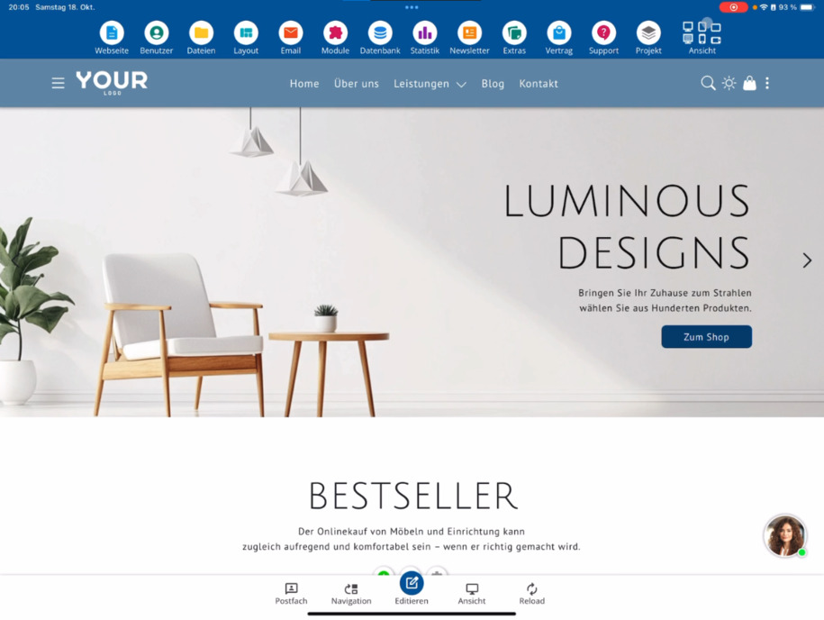
Check the website in various device views – overview of desktop, tablet, and mobile
In this tutorial, you will learn how to check your website on desktop, tablet, and mobile, switch between public view and edit mode, and ensure that your content displays optimally on all devices.
Check your website in different device views
In this tutorial, you will learn how to test your website in different device views – for example, on the tablet or mobile. This way, you can see directly how your design looks on all devices.
Switch between device views
In the top right corner, you will find several buttons that allow you to switch between the different views. You are currently in the desktop landscape view. Try out how your website appears in tablet portrait mode, tablet landscape mode or on the mobile – both in landscape and portrait orientation.
Public view and edit mode
Below the desktop monitor, there is another important view: the striped desktop monitor. With this button, you can switch between the public view and edit mode.
Differences between edit mode and public view
In edit mode, you see all the Edit buttons and menu items that are only available internally. When you switch to public view, these elements disappear. You will then see the website as visitors do – without editing features. A clear indication of this is the visible cookie notice at the bottom of the page.
Check views on different devices
You can also test how your website is displayed in the public view on a phone or tablet. This ensures that menus, texts, and images are displayed optimally everywhere.
Back to edit mode
If you want to make changes again, just click on the striped monitor. This will take you back to edit mode where you can use the quick edit buttons again.
Tip: Regularly check how your website appears in different views to ensure that it looks perfect on all devices.
FAQ
what customers often ask us
How can I check my website in different device views?
You can test your website directly in the editor in different device views – for example, on the tablet or mobile. This way, you will immediately see how your design is displayed on all devices.
Where can I find the buttons to switch views?
At the top right of the editor, there are buttons that allow you to switch between device views. Try out how your website looks in tablet portrait mode, tablet landscape mode or on the mobile – both in portrait and landscape.
What does the striped desktop monitor below the view mean?
The striped desktop monitor is a symbol that allows you to switch between the public view and edit mode. This allows you to check how your page looks for visitors at any time.
What is the difference between edit mode and public view?
In edit mode, you see all the Edit buttons and menu items that are only available internally. In the public view, these disappear, allowing you to see your website as it appears to visitors. This is also recognizable by the displayed cookie notice.
Can I switch device views in public view as well?
Yes, you can also check how your website is displayed on a phone or tablet in the public view. This way, you can ensure that all content is displayed optimally on mobile devices.
How do I return to edit mode?
If you want to make changes again, just click on the striped monitor. This will switch you back to edit mode and you can use the quick edit buttons again.